Does your business have a Brand Style Guide?
This is the ONE thing that will keep your brand on track.
Because your branding (which includes everything you put out in the world as your business) is the thing that provides consistency in how you present yourself. And your consistency is what gets you noticed, AND remembered when people go to purchase the thing that you sell.
But more than that – excellence in branding radiates EXACTLY who you are and how you wish to show up in the world. And your exact right audience is drawn to that like a magnet.
So what exactly is a Brand Style Guide for business, and how big does it have to be?
Brand Style Guides (sometimes called a Brand Identity Guide, or even a Brand Logo Guide) is simply a document that summarises your brand elements.
Now I’ve seen corporate Brand Style Guides which are massive – like medium-sized books. They go through everything imaginable and possibly more besides. Not only do they have alllll the information for colours (CMYK, RGB, HEX, HSL and Pantone), specify fonts and logo, they also specify things like how big the logo needs to be in particular situations, how much space it needs to have around it, variations that are acceptable (which colour combinations to use, black and white versions, simplified avatar versions, etc), and those variations that are not acceptable (don’t stretch the logo, whatever you do!!), what combinations the fonts can be used in and how big they need to be in relation to each other, what types of images are acceptable, what combinations of colours to use in which situations, and lots and lots of examples of the branding in practice – layouts for posters, leaflets, social media, and more.
It’s huge!! And these corporate guides have one specific purpose – to ensure that even the most inexperienced junior on their design team can pull out something that aligns totally with the business vision and brand voice.
What should a solopreneur include?
As a small business – as solopreneurs, or those with a small team such as a holistic practitioner with a VA or two – you don’t need anything quite so massive as a whole book.
But you DO need one.
Your Brand Style Guide doesn’t spring out of the ether, fully formed either. It should be the culmination of deep research into your target market – who they are and what they want, as well as infusing your own personality into it – who do you want to be seen as? What aspects of your personality do you want to radiate?
Most important of all –
What do you want your brand to FEEL like?
Once you have that sorted, go ahead and choose/create your elements. Here’s the important bits to include on your guide: (and best of all you can fit this all onto one page! Print it out and stick it on the wall next to you as a ready reference.)
Business Name and Logo
Well, duh. And if don’t have a logo as such – that’s perfectly fine too! Because I bang on ALL THE TIME about logos – a logo by itself is not a brand. (But if you need help creating a logo for your brand along with the rest of the elements, get in touch)
Brand Keywords
These are vital. Your brand keywords are a list of what you want your brand to feel like, what qualities you want to project, and what you stand for. Use them as a filter for EVERYTHING you put out in the world as your brand, and you’ll create your own brand voice, strong and pure. And THIS is what your audience will find magnetic. That consistency, that personality.
Colours
As a society, we’re heavy on the digital these days, so most of the time you’ll just need your HEX codes. But depending on your business, you might also need the colours for printing, so include the CMYK equivalents too.
Fonts
You should have absolutely no more than three of these. You can have one fancy or display font for headings, then possibly a subheading font (which should be fairly readable still – not too fancy or it will compete with your main display font), and your text font. And it depends on where and how you use these too – if you’re creating a graphic for social media for instance, stick to one or two fonts at the most – anything more looks really messy (unless you’re an uber-clever designer).
Patterns and Icons
If you have them. These are extra decorative bits you can pop in here and there to further raise your brand’s individuality. These are definitely not necessary, and if you have them you need to use them sparingly – but having a pattern or two to use as a background here and there in social media or website images, or a set of custom icons that you can pop into your graphics (or even use as bullets in any lists you make) can really make your brand shine.
Image style
Include several examples of the types of images you want to stick to. This is not just about the subject matter (eg .people, or beach images), but also be aware of the style of image too (do you want them dark and moody, or light and soft? Lots of bright colour, or subdued? Serene and minimal compositions, or lots of interesting detail? etc.). Use your brand keywords as a filter, particularly when you’re choosing stock photos for your business. It makes the choice so much easier!! When you go to your favourite stock photo site, ask yourself, “does it feel like [insert your chosen qualities here]?”. If the image does NOT feel like that, then doesn’t matter how pretty the image is, or how much you love it – IT’S NOT FOR YOU! (well OK, you can still keep it for yourself if you want – just don’t use it in your business). For instance, if your brand is peaceful, creative and intuitive, you don’t want to choose pics that feel like a grimy cityscape. Or, if you want your brand to feel a little magical and sensuous, then don’t choose images that feel austere or minimalist. Use those keywords to filter everything!!
Examples
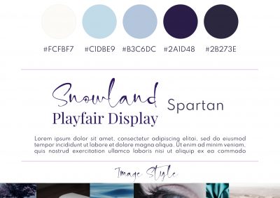
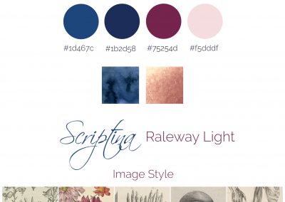
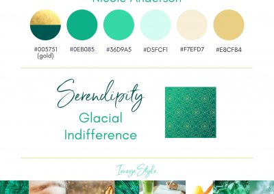
Here’s some Brand Style Guide examples I’ve created for clients.
They’re all in a format that works for me to create the printable A4 version, but there are plenty of other ways you can arrange the elements too – have a search around on Pinterest and you’ll see plenty of examples.
Your 1-page Brand Style Guide is a great reference tool for you. However, when you start to assemble a team, you want to make sure your team is on board with what your brand stands for too – and so it’s in your interest to start describing other parameters for your branding as well – and create a “second layer” guide to go with the one-pager.
Because even though you’ve identified specific colours and fonts, and you have the logo – there are still almost endless ways to put those things together. And because often, we have a whole lot of unspoken ideas in our heads, and WE know what we mean, but other people don’t. And when you don’t specify some of those key qualities, your VA will surprise you with how inventive they actually are! ;D
This “second layer” guide doesn’t need to be extensive either – it just requires you to be clear on exactly the personality you want your brand to exude, who your audience is and what they’re looking for.
It can be text-only (you writing down what, and what not to include), it can include visual examples of what you mean, or any combination of the above. It’s up to YOU as to what you think needs to be specifically mentioned in order to keep your brand on track.
Firstly, double down on your brand keywords – because these are first and foremost a filter for everything you put out in the world as your brand. So, if your branding is sophisticated and sleek, then you don’t want your VA using the same cheesy Pixabay image everyone else has used. Nor do you want them adding in bright colours, or clipart.
There are more subtle things to include too. You might want to include instructions like “don’t use diagonals”, or “don’t use italics”. Other things you might want to define include whether you use UK or US English, the use of gradients and overlays, proportions of colours in a single graphic, whether you allow all capitals in text, and more.
In my own branding, I’ve specified that my images need to be of plants (particularly flowers), very low saturation (but NOT black and white), light, bright and low contrast. I don’t use circles or diagonals, and I only use my script font Botdoh sparingly for emphasis on no more than two or three words at a time.
Even more so than your business and existing branding, this “second layer” guide is a work in progress too. When your VA creates something you don’t like, or uses elements that you wouldn’t – think very carefully about why that is, and why it doesn’t work for your brand. This will give you some even deeper insights into what you DO want your brand to stand for!
The benefits:
Your Brand Style Guide should be a reference for now, to keep you laser-focused on your business vision – what you stand for, and what you want to be known for. It should radiate who you are.
And that’s all good for business! A strong voice means your audience will be drawn to you like magnets AND it’ll turn the wrong people away so you don’t even have to worry about wasting time with them.
Wins all round.


