Ever wondered how the whole branding process works when you engage a designer?
Because let’s face it – a good designer can charge $1000 or more for a full branding package – so what do you get for all that money? So, I thought I’d break it down, giving a REAL example of a client I worked with to create a standout brand.
Meet Fran.
Fran’s an excellent bookkeeper with a long-established business, based in the Canberra region
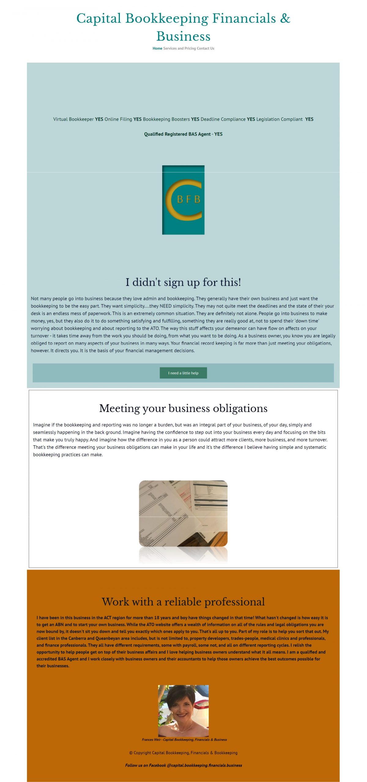
Here’s a sneak peek into what she had before she came to me – it was all DIY, built with one of those generic “site builder” apps that came with her hosting/domain name package. While she had some colours, a couple of fonts, and a logo, her home page for her site Capital Bookkeeping, Financials & Business was not engaging at all and didn’t give any sense of who Fran was, or give any compelling reason as to why anyone would pick her over the thousands of other bookkeepers in Australia.
She originally came to me for just a redesign of her website, to make it feel much more professional and engaging. But after providing her with some layouts based on the old branding, she decided that it would be far better to rebrand as well – to create a far more immersive and stronger presentation of who she actually was and how she helped businesses to be much more strategic and profitable.
This is the job of branding – to radiate who you are, to show how much you love what you do, to present what you do with vitality, strength, and depth.
Once she decided she would like a complete rebrand, we got to work.
Initial interview
For me, your brand should be based on what outcome your target market is looking for, and infused throughout with your own personality. This is what makes it special to YOU.
So in a 1:1 via Zoom, Fran and I talked through key aspects of who she is as a person, as well as her business. We talked about exactly what she does, the issues she targets in her business (not all bookkeepers are the same!), her skills, and what led her to start working in bookkeeping. We also talked about her as a person – her favourite things, and best personal qualities. And we also talked about her plans for her business over the next few years.
We dug into what’s important to her clients and potential clients, and how they want to feel after working with her – because it’s these emotional qualities – clarity, strength, confidence, and calm – that potential clients respond to, where they say “She’s the bookkeeper for me!”. It’s never just about price.
Colour and style are last on the list of things to discuss – it’s great if you have a favourite colour! But if you don’t, that’s OK – my superpower is to extract all this visual style information from you while we talk. You can learn a LOT about a person just by talking with them for a bit – listening, looking, and using your intuition.
Which is exactly what I do.
The mood board
The first step for me is to create a mood board. This is a collection of curated images that represent the overall FEEL of what you’re aiming to achieve. I’ll include images that are symbolic/representational (in Fran’s case, money is an obvious thing, and so are pictures of women working at laptops and business admin), but also growing plants as a symbol of nurturing growth, mountains as a symbol of striving for greatness, and there are also lifestyle images.
For each of the design steps (mood board, colours/fonts/keywords, and logo) – there’s a draft and review process, so there’s always plenty of room for input from you about how you want things to look.

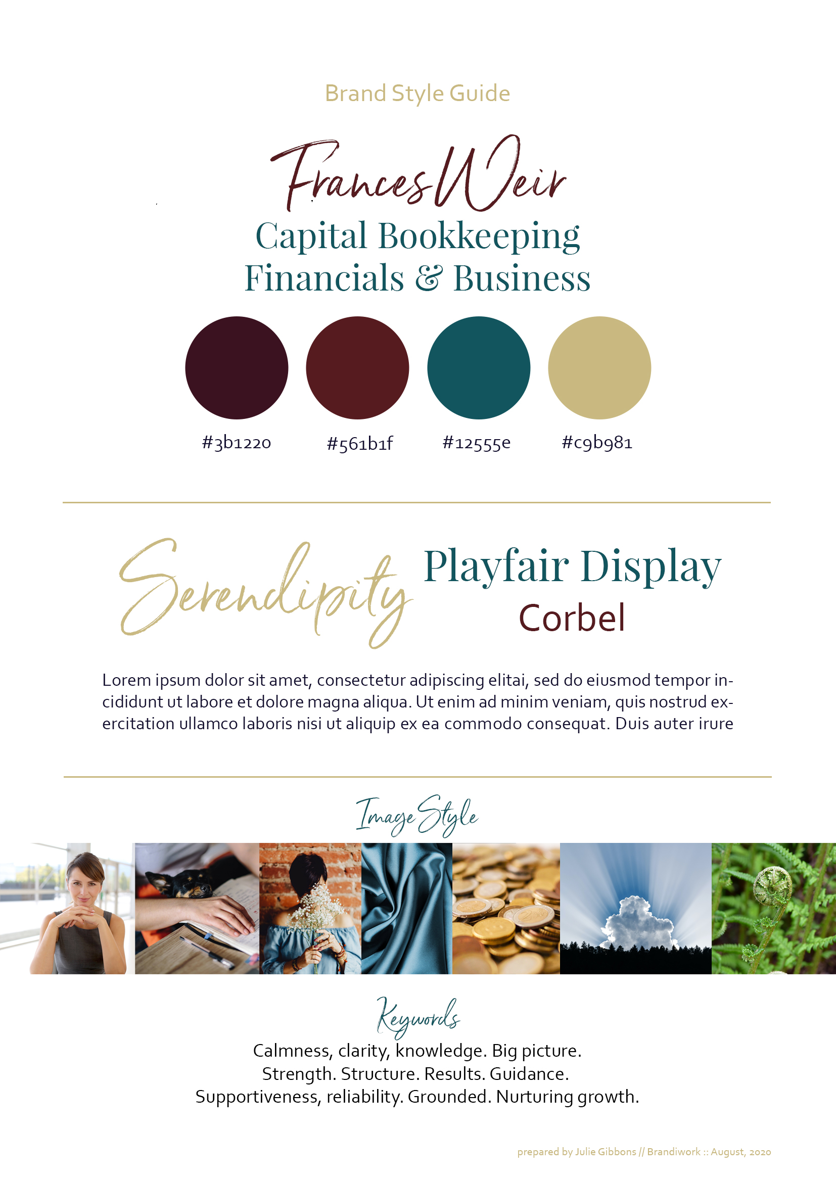
Choosing brand keywords, colours, and fonts
Depending on what we’ve talked about in the interview and what we’ve come up with in the mood board, sometimes the colours will be obvious (as in Fran’s case), and sometimes they can come within this next step.
We also choose fonts, based on (you guessed it!) how they FEEL. This is not a choice based on whim – there’s a whole bunch of psychology as to why certain shapes feel the way they do.
In combination, Fran’s fonts feel reliable and sophisticated, yet still personable.
Again, this one-page guide went through a draft and review process with Fran, to ensure it was exactly what she wanted.
The logo
AH! We’re finally here you say. Surely the logo’s the most important thing?
Well for me, the logo needs to come LAST. It needs to spring out of all the foundation work we’ve put in so far. Your brand is NEVER just a logo – it’s everything you put out in the world as your business – the way you appear on camera, the things you write about in social media, the graphics you create, that Powerpoint presentation you gave last week. EVERYTHING.
Your logo is just the final cherry on top of your (beautifully styled) dessert.
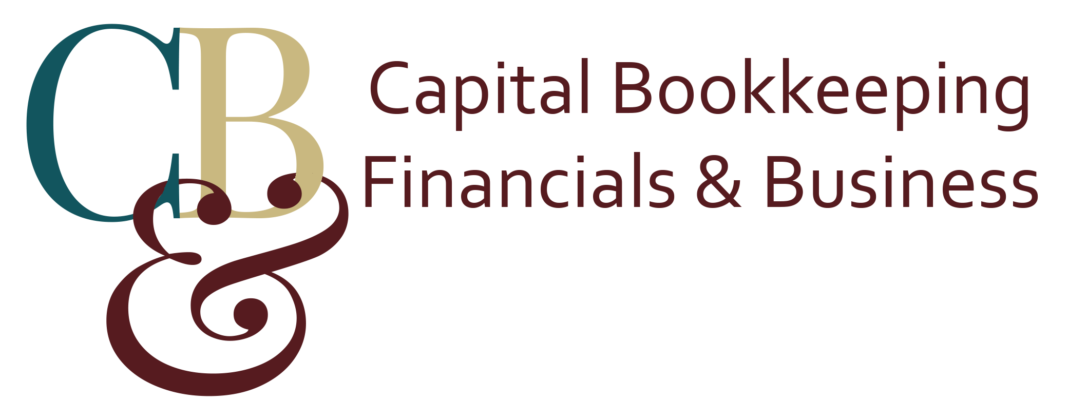
There are lots of different categories of logos – from those that use type (as in Fran’s, with her monogram-style mark, or Disney), those that have a bit of type in combination with an image (Amazon, Starbucks), or those that are image only (Apple, Instagram). There’s a tonne of style variation too.
With Fran’s, we decided that the monogram-style conveyed a sense of reliability and tradition with it, and these were useful qualities for a bookkeeper to display. I’m also a big fan of its simplicity.
The simplicity is deceiving though – like a lot of things, it takes a lot of effort (and knowledge) in order to make things look effortless. For Fran’s logo, there were four different original concepts I presented to her, and the final monogram went through six iterations to get to this beauty.

Showing the branding in action
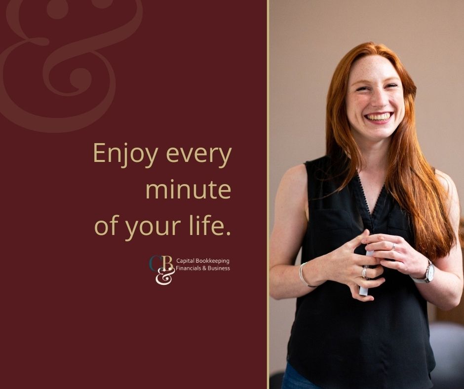
It’s not enough to create a beautiful brand and then just let my clients walk away and fend for themselves with it. I want them to feel empowered with their branding! To feel they can get started straight away, to be able to pop up a couple of posts on social media without having to stress.
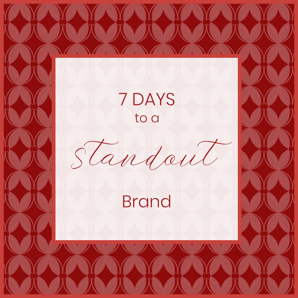
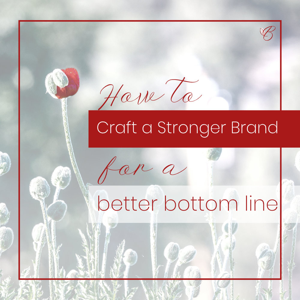
So I create a sample pack of graphics to show them how beautiful it is in action.
Finally, I collate it all for you.
Lastly, I create a Brand Style Guide document for you, which includes a summary of it all – your business and aims, your target market, a one-page printable of your brand elements, and an explanation of those elements (the what and why, to keep you on track).
This is your brand strategy document – a snapshot of where you are now, and your big, audacious vision – so you can use it to keep you on track now, and as a beacon so you’re always pointed towards where you want to go.
(And if you wanted to take it one step further)
After we completed the branding, THEN we went back to the website – and created a stunner.
That’s a whole ‘nother level!
The result? A total transformation!
Back to Fran:
If you’re looking for a not-just-a-bookkeeper to help you with you with everything from record-keeping and systems to fulfil your tax obligations, right through to business strategy – all served with straight-up solid advice on money – then get in touch with Fran. You can find her at capitalbfb.com.au

